Screen
A screen of the app — a header, the content (scrolling, rising with the keyboard), a footer — and the templates built on it: app shell, sign-in, profile, feed, chat, settings.
Mobile only — React Native, from @krizaka/ui/native. Beta: its API may still change in a minor version.
When to use
- Every screen of a React Native app.
- The starting point of a new app: copy a template and fill it.
When not to use
- For a sheet over a screen.Use instead: Dialog
Installation
Install
npx expo install react-native-svg
npm install @krizaka/ui
Import
import { Screen } from "@krizaka/ui/native";Wrap the app once in ThemeProvider from @krizaka/ui/native: every component reads its colour roles.
Examples
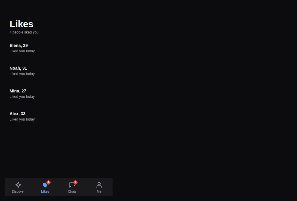
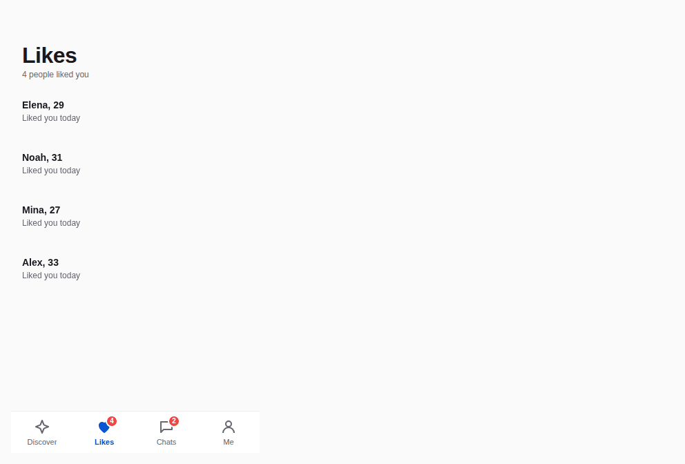
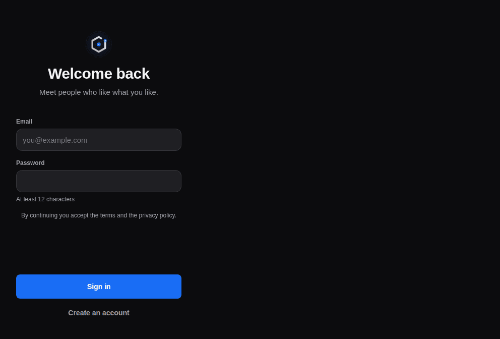
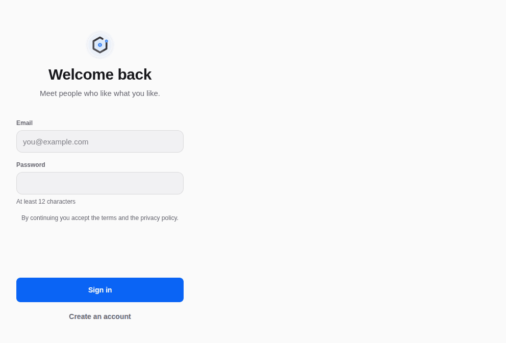
React Native has no live preview on the web: each example shows the screenshot of its story, tested in both themes, and the code to copy.
App shell
A header, a section's content, the tab bar.
Sign in
The mark, two fields, the main action pinned.
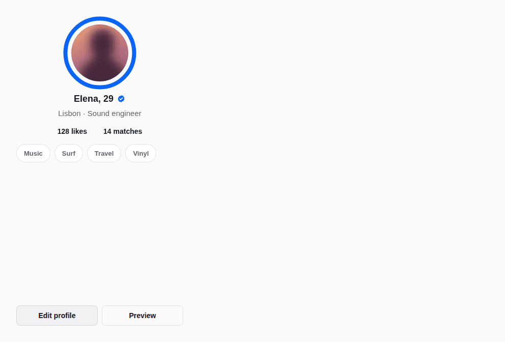
Profile
The photo and its ring, the facts, the interests.

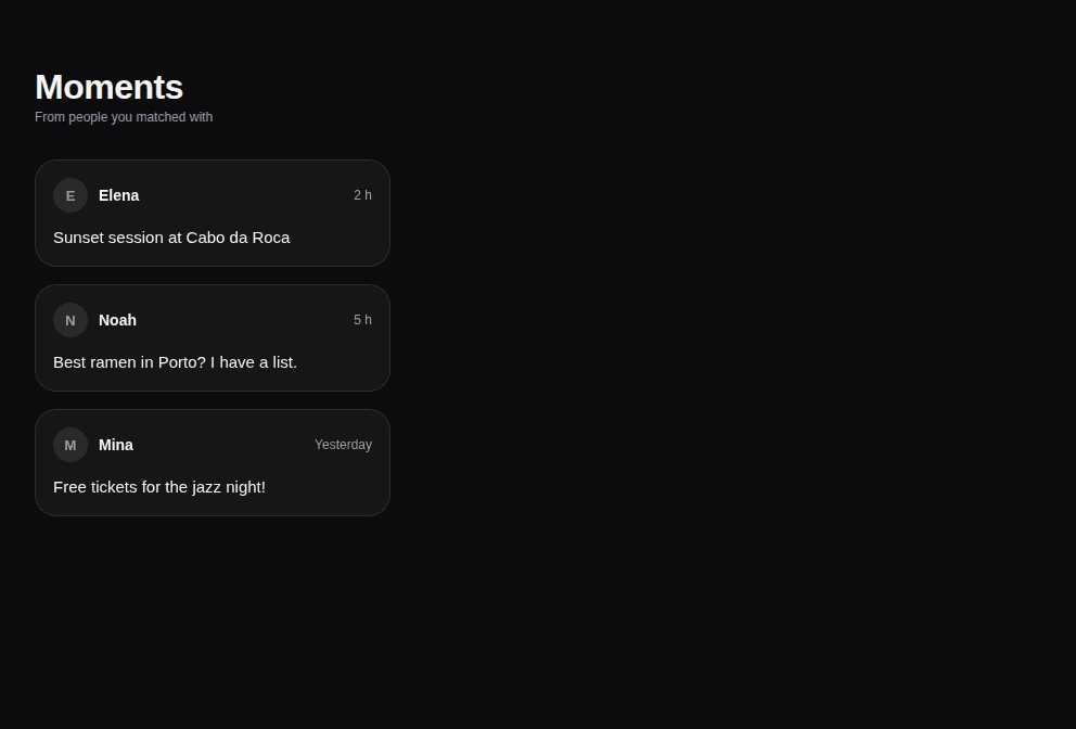
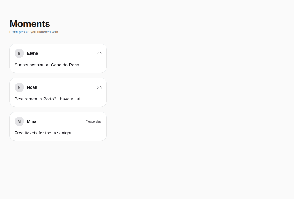
Feed
A large title over a list of cards.
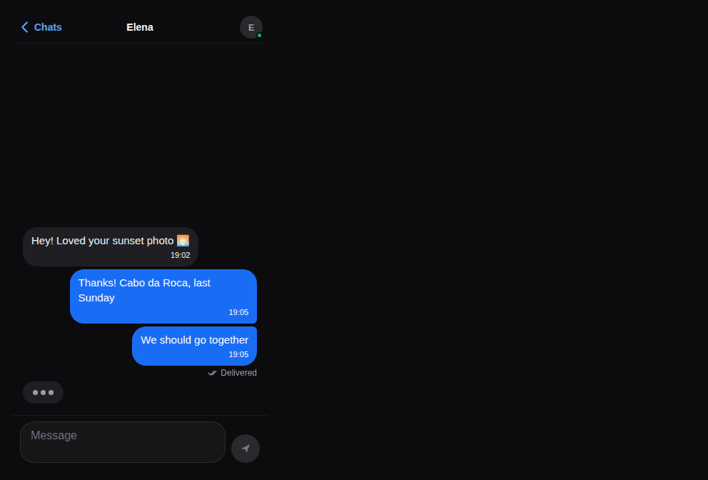
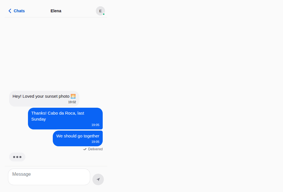
Chat
The person, the messages, the composer.
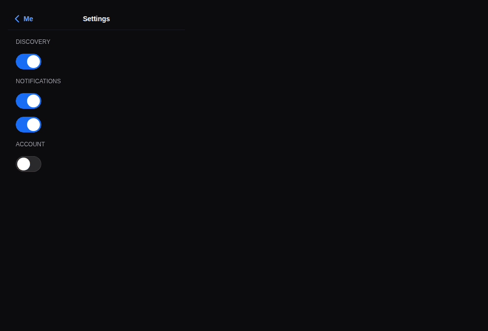
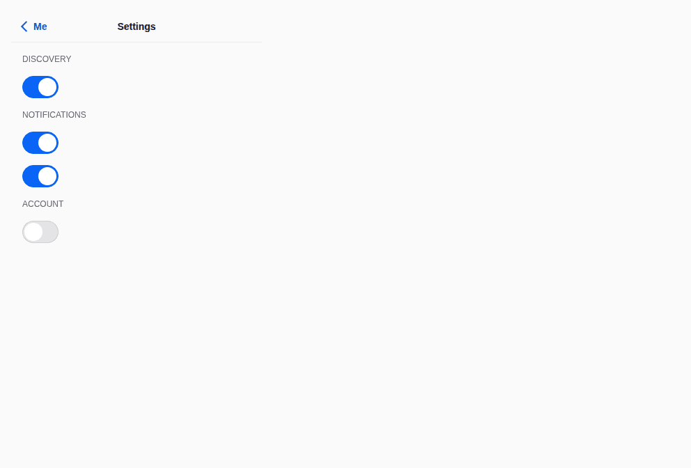
Settings
Sections of switches that apply at once.
Props
A screen of the app: a header, the content (scrolling, rising with the keyboard), a footer — on the theme's surface, clear of the safe areas through its parts. The base of the templates: app shell, sign-in, profile, feed, chat, settings.
| Prop | Type | Default | Description |
|---|---|---|---|
childrenrequired | ReactNode | — | The content. |
contentStyle | StyleProp<ViewStyle> | — | Styles of the content. |
footer | ReactNode | — | At the bottom: a TabBar, a MessageComposer, a main Button (they keep clear of the home indicator). |
header | ReactNode | — | At the top: a Header, a StepProgress (they keep clear of the status bar themselves). |
keyboard | boolean | true | The content rises with the keyboard (a form, a chat). Default true. |
padding | number | 16 | Padding around the content. Default 16. |
scroll | boolean | true | The content scrolls (default) — or not, for a list that scrolls itself (List, FlatList). |
surface | "surface0" | "surface1" | surface0 | The surface: surface0 (default) or surface1. |
Accessibility
- The parts keep the safe areas; the content scrolls and is reachable by the keyboard on the web.
Best practices
- Put a
Header(or aStepProgress) inheaderand aTabBar, a composer or a main button infooter. scroll={false}when the content is a list that scrolls itself.
Related components
Generated from the code of @krizaka/ui 3.5.0: its meta.ts, its examples and its types.Edit this documentation on GitHub
Page header
The top of a page: a breadcrumb, the title, a description and the page's actions.
Scroll stage
The conductor of a told page: chapters (Scene) that play their entrance once, in order, as they scroll into view — the visual, then the announcement, then the words — with one slow loop each, running only while on screen.