Header
A screen's header: the bar under the status bar, and a large title that folds into it as the content scrolls.
Mobile only — React Native, from @krizaka/ui/native. Beta: its API may still change in a minor version.
When to use
- The top of a section of the app: Earnings, Messages, Jobs.
- A detail screen with a back button (
size="inline").
When not to use
- For the app's sections.Use instead: Tab bar
- For a page header on the web.Use instead: Page header
Installation
Install
npx expo install react-native-svg
npm install @krizaka/ui
Import
import { Header, useCollapsingHeader } from "@krizaka/ui/native";Wrap the app once in ThemeProvider from @krizaka/ui/native: every component reads its colour roles.
Examples
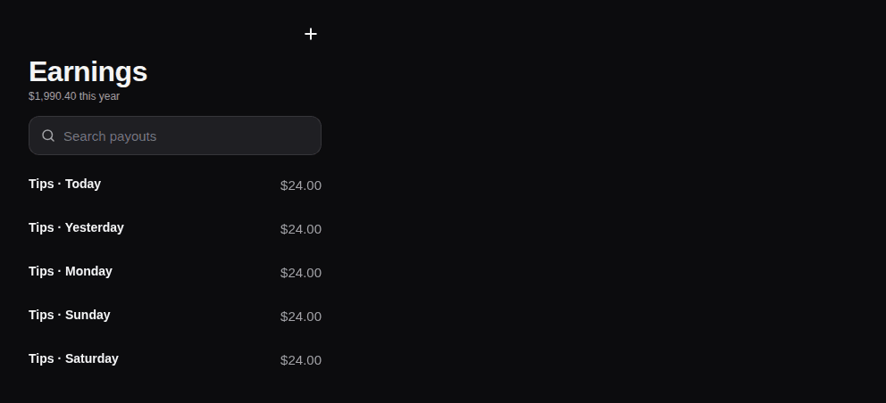
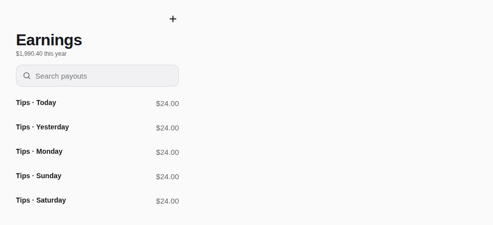
React Native has no live preview on the web: each example shows the screenshot of its story, tested in both themes, and the code to copy.
Large title
Folds into the bar as the list scrolls; a search field under it.
Props
A screen's header: the bar (back, title, actions) under the status bar's safe area, and a large title that folds into
the bar as the content scrolls — the iOS idiom, readable on Android. Feed it the list's scroll with
useCollapsingHeader(). The title is the screen's heading for screen readers either way.
| Prop | Type | Default | Description |
|---|---|---|---|
titlerequired | string | — | The screen's title — a heading, shown large under the bar until the content scrolls under it. |
actions | ReactNode | — | Buttons at the right of the bar (IconButtons). |
backLabel | string | — | The back button's words (“Back”) — passed translated; with onBack it shows. |
children | ReactNode | — | Under the title: a SearchField, Tabs. |
onBack | (() => void) | — | Called by the back button. |
scrollY | Value | — | The scroll position of the screen's list (useCollapsingHeader().scrollY): the large title folds into the bar. Absent: always large. |
size | "inline" | "large" | large | large (default: the top of a section) or inline (a detail screen: the title in the bar only). |
style | StyleProp<ViewStyle> | — | Styles merged last. |
subtitle | string | — | A line under the large title (a count, a date). |
Accessibility
- The title is the screen's heading for screen readers, folded or not.
- The back button is named by
backLabel.
Best practices
- Feed it the list's scroll with
useCollapsingHeader(). - Put a search field or tabs under the title as
children. - Two actions at most in the bar.
Related components
Generated from the code of @krizaka/ui 3.5.0: its meta.ts, its examples and its types.Edit this documentation on GitHub
Command
A command palette on cmdk: a search input over a filtered list of commands, inline or in a dialog.
Nav bar
The Krizaka navigation bar: a floating pill that tightens as the page scrolls, one light that glides to the item under the pointer or the focus and rests on the current page, accessible menus with rich links, and a mobile panel.