Permission prompt
Before the system's permission dialog, the app says why: a bird, what it is for, the button that asks — and the way to the settings once refused.
Mobile only — React Native, from @krizaka/ui/native. Beta: its API may still change in a minor version.
When to use
- Before the camera, the microphone, notifications, the photo library.
- When the permission was refused for good: the way to the settings.
When not to use
- For a message that needs no permission.Use instead: Empty state
Installation
Install
npx expo install react-native-svg
npm install @krizaka/ui
Import
import { PermissionPrompt } from "@krizaka/ui/native";Wrap the app once in ThemeProvider from @krizaka/ui/native: every component reads its colour roles.
Examples
React Native has no live preview on the web: each example shows the screenshot of its story, tested in both themes, and the code to copy.
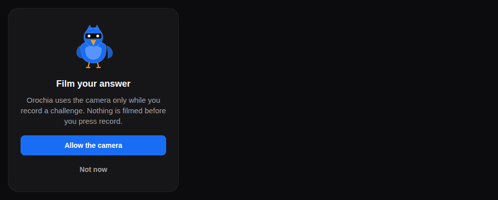
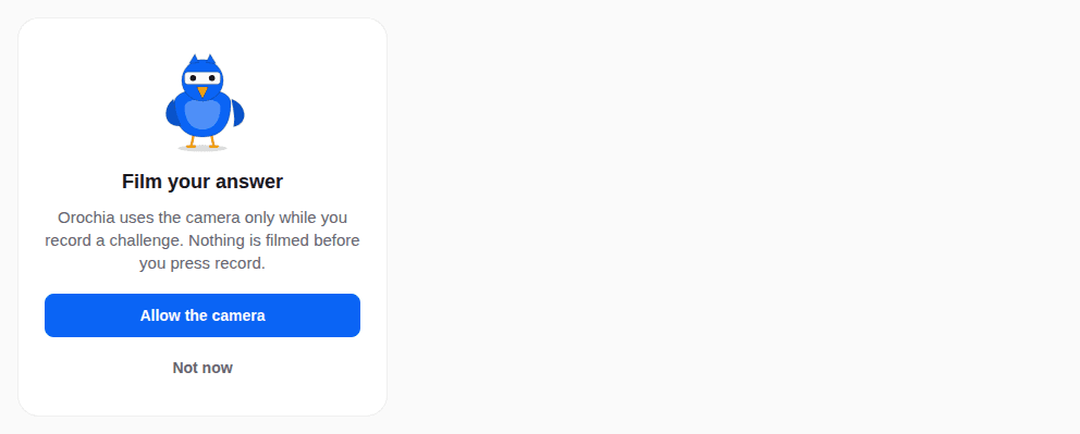
Camera
Why the camera, before the system asks.
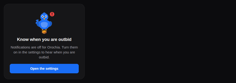
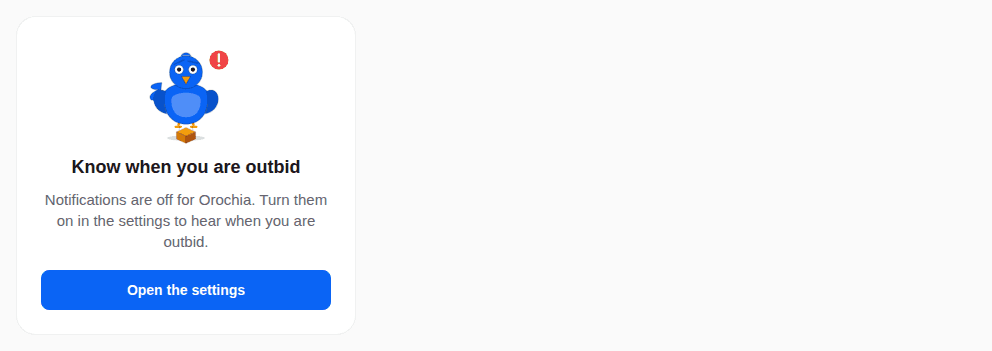
Blocked
Notifications refused: the way to the settings.
Props
Before the system's permission dialog, the app says why: a bird, what it is for, the button that asks — and, once the system will not ask again, the way to the settings. Once granted, its children (the camera, the feature) show.
| Prop | Type | Default | Description |
|---|---|---|---|
allowLabelrequired | string | — | The button that asks (“Allow the camera”). |
descriptionrequired | string | — | Why the app needs it, said plainly, before the system asks. |
onAllowrequired | () => void | — | Asks the system (requestPermission() of the module). |
statusrequired | PermissionStatus | — | Where the permission stands (from expo-camera, expo-notifications…): blocked = denied and the system will not ask again. |
titlerequired | string | — | What it is for, in a few words (“Film your challenge”) — passed translated. |
blockedDescription | string | — | The words when it is blocked (“The camera is off for Orochia. Turn it on in the settings.”). |
children | ReactNode | — | Rendered once granted: the camera, the screen. Absent: nothing. |
dismissLabel | string | — | A secondary way out (“Not now”), with onDismiss. |
mascot | "falcon" | "owl" | "duck" | "flamingo" | "pigeon" | "lovebird" | "crane" | falcon | The bird above (decorative): the falcon watches (camera), the pigeon delivers (notifications). Default falcon. |
onDismiss | (() => void) | — | Called by the way out. |
onOpenSettings | (() => void) | — | Opens the app's settings (Linking.openSettings()). |
settingsLabel | string | — | The button when the system will not ask again (“Open settings”) — with onOpenSettings. |
style | StyleProp<ViewStyle> | — | Styles merged last. |
Accessibility
- The bird is decorative; the words carry the message.
- Once granted it renders its children: the feature itself.
Best practices
- Ask in context, when the feature is used, never at launch.
- Say what the app does and does not do with it, in one or two sentences.
- Pass the module's status:
blockedwhen the system will not ask again.
Related components
Generated from the code of @krizaka/ui 3.5.0: its meta.ts, its examples and its types.Edit this documentation on GitHub
Mascots
The Krizaka flock: seven birds (falcon, owl, duck, flamingo, pigeon, lovebird, crane) in five moods, drawn in the product's brand colours — and the phoenix, the comeback.
Progress
How far a task or a goal has come: a bar or a ring — with its words and time left, what is buffered ahead, its steps as segments, and a paused or failed state that says where it stopped.