Floating action button
The screen's one main action, floating above the content in the accent, clear of the safe area and the tab bar.
Mobile uniquement — React Native, depuis @krizaka/ui/native. Bêta : son API peut encore changer à une version mineure.
Quand l’utiliser
- Create on a list screen: a new challenge, a new message.
- Record on a camera-first screen.
Quand ne pas l’utiliser
Installation
Installer
npx expo install react-native-svg
npm install @krizaka/ui
Importer
import { Fab } from "@krizaka/ui/native";Enveloppez l’application une fois dans ThemeProvider de @krizaka/ui/native : chaque composant lit ses rôles de couleur.
Exemples
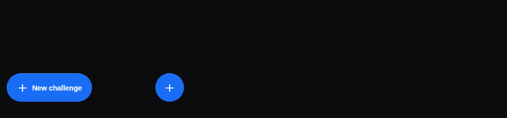
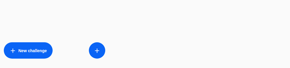
React Native n’a pas d’aperçu en direct sur le web : chaque exemple montre la capture de sa story, testée dans les deux thèmes, et le code à copier.
Extended and round
With its words, and the round button alone.
Props
The screen's main action, floating above the content in the accent — one per screen (create, compose, record). It
keeps clear of the safe area and the tab bar (offset), shows its words when extended, a light tap confirms.
| Prop | Type | Défaut | Description |
|---|---|---|---|
iconrequis | ReactNode | — | The icon (decorative). |
labelrequis | string | — | The action in words (“New challenge”) — passed translated: the accessible name, and shown when extended. |
onPressrequis | () => void | — | What it does. |
extended | boolean | — | Shows the words beside the icon (collapse it while the list scrolls down). |
offset | number | 0 | Extra distance from the bottom, above a tab bar (its height). Default 0. |
placement | "center" | "end" | "start" | end | Which corner. Default end (bottom right in left-to-right). |
style | StyleProp<ViewStyle> | — | Styles merged last. |
Accessibilité
- A button named by
label, extended or not. - 56 points high; a light tap when pressed.
Bonnes pratiques
- One per screen, for the action the screen exists for.
extendedshows the words; collapse it while the list scrolls down.- Pass the tab bar's height in
offset.
Composants liés
Générée depuis le code de @krizaka/ui 3.5.0 : son meta.ts, ses exemples et ses types.Modifier cette documentation sur GitHub