Txt
Text in the platform's type scale, coloured by a role of the current theme.
Mobile uniquement — React Native, depuis @krizaka/ui/native. Bêta : son API peut encore changer à une version mineure.
Quand l’utiliser
- For every text of a React Native screen: titles, body, captions, labels, figures (
mono).
Quand ne pas l’utiliser
Installation
Installer
npx expo install react-native-svg
npm install @krizaka/ui@beta
Importer
import { Txt } from "@krizaka/ui/native";Enveloppez l’application une fois dans ThemeProvider de @krizaka/ui/native : chaque composant lit ses rôles de couleur.
Exemples
React Native n’a pas d’aperçu en direct sur le web : chaque exemple montre la capture de sa story, testée dans les deux thèmes, et le code à copier.
Variants
display, title, body, caption, label, mono.
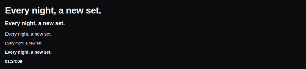
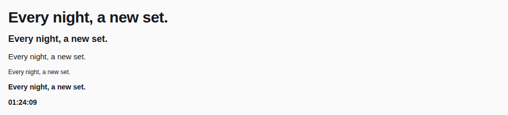
import { Txt } from "@krizaka/ui/native";

// The platform's type scale: display · title · body · caption · label · mono.
export default function NativeTxtVariants() {
  return (
    <>
      <Txt variant="display">Every night, a new set.</Txt>
      <Txt variant="title">Every night, a new set.</Txt>
      <Txt variant="body">Every night, a new set.</Txt>
      <Txt variant="caption">Every night, a new set.</Txt>
      <Txt variant="label">Every night, a new set.</Txt>
      <Txt variant="mono">01:24:09</Txt>
    </>
  );
}
Tones
text, secondary, muted, accent.


import { Txt } from "@krizaka/ui/native";

// The text roles; `muted` reaches AA only as large text, like the status roles.
export default function NativeTxtTones() {
  return (
    <>
      <Txt tone="text">Every night, a new set.</Txt>
      <Txt tone="secondary">Every night, a new set.</Txt>
      <Txt tone="muted" variant="display">
        Every night, a new set.
      </Txt>
      <Txt tone="accent" variant="title">
        Every night, a new set.
      </Txt>
    </>
  );
}
Props
Text in the platform's scale, coloured by a role of the current theme. title and display are headers for screen readers.
| Prop | Type | Défaut | Description |
|---|---|---|---|
tone | TxtTone | text | A text role of the theme (default text). |
variant | TxtVariant | body | The type scale: display · title · body (default) · caption · label · mono (tabular figures). |
Accessibilité
titleanddisplayare headers for screen readers.- It follows the system's font scaling.
Bonnes pratiques
- Pick a
variantfrom the scale and atonefrom the roles: never a font size or a colour by hand. mutedonly for large text or what is off: it reaches AA only as large text.
Composants liés
Générée depuis le code de @krizaka/ui 2.0.0-beta.6 : son meta.ts, ses exemples et ses types.Modifier cette documentation sur GitHub